Businesses in Miami need a strong digital presence to stay competitive. One of the most…

What are the Best Website Design Tips
You will lose leads if your website is badly designed. They will go to a competitor’s company instead of yours, leading you to lose business. A professionally Website Design that entices and engages leads is required to attract leads. This will keep your leads on your website longer, resulting in more conversions for your company.
Create a design that reflects your company.
Because your website is an extension of your brand, it should have a design that reflects your company. It’s critical that you choose a design that complements your brand since it’ll be how people remember you. This is something that you should focus more on at the time of Website Design.
Your design is determined by the sort of company you have. If you’re a graphic design firm, you could have a more sophisticated site design. A doctor’s office, on the other hand, has a straightforward style that reflects their business. Overall, you want to use colors and styles that remind your target audience of your company. This will aid in the awareness of your brand and the creation of a feeling of affiliation with your company. You can keep leads on your website for longer by choosing a clean and contemporary style that matches your organization.
Make a basic landing page
You usually send visitors to your homepage to learn about your company, whether you utilize search engine optimization (SEO) or pay-per-click (PPC) advertisements. They may then visit your website to gain more in-depth information after they’ve arrived. The homepage, on the other hand, is a valuable resource for informing leads about your firm since it is a first depiction of your brand.
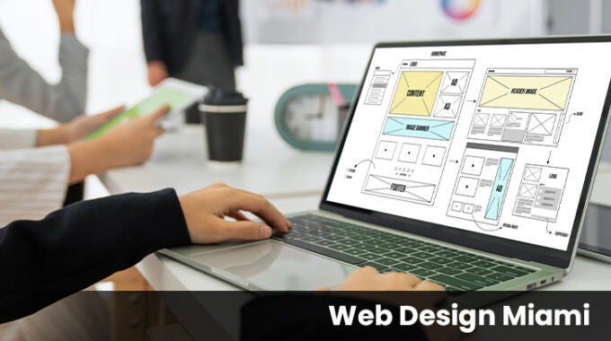
It is critical that you create a basic yet effective site. You don’t want to confuse your visitors by providing too much information. You’ll lose leads if your website is overly crowded. Your homepage should have items that will pique your audience’s curiosity. Instead of a block of text, you should concentrate on visual components. Visitors are kept interested by visual features, which inspire them to learn more. You need to get in touch with the Website Development team and explain this requirement.
You may use graphic components to connect to sites with additional information instead of blocks of text. This allows readers to examine various parts of your company and determine what to look at next. Only add relevant information on your homepage to make it effective. This will prevent your website from getting too busy and will help visitors to easily traverse your pages.
Make navigation simple as much as possible
One of the most significant aspects of your website is the navigation. People utilize your navigation to locate information on your website. You want users to be able to navigate to the appropriate sites without difficulty.
When designing your navigation, make sure it’s basic and straightforward. You want to make broad headers that can be broken down further into individual subheadings. This will aid in the organization of your website as well as the discovery of material by your visitors. A WordPress Website Developer will be able to do this quite effectively.
Users will not be able to discover information if your navigation is bad. They’ll have a hard time finding the proper pages. This will lead them to abandon your site and go to one of your competitors’. Create an effective navigation that helps leads locate the information they need to stay on your website longer.
Use of a responsive design
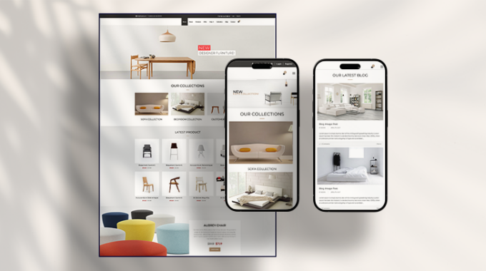
A responsive design is one of the most important aspects of your website. Because it influences how people interact with your site, responsive design is critical. Your website’s responsive design adjusts to the device that a user is using. Whether they’re using a mobile phone or a desktop computer, both users will experience your site in a manner that is appropriate for their device. This is crucial for people to stay engaged on your site.
Users will struggle to utilize your website if it looks exactly like the desktop version on every device. Users would have to zoom in to view everything since the wording and links are too tiny. If your website is created like your desktop design, they won’t be able to see it in its full on a mobile phone.
This kind of design is critical for your website since it allows mobile and tablet customers to properly see it. They have a smooth experience on your website, allowing them to enjoy their time there. This keeps visitors on your site for longer, regardless of the device they’re using.
Make the website easy to use
Many potential customers will browse your website for information. They’re seeking for a certain piece of information. Therefore, they’ll swiftly search your site for it. This is particularly true for those who use their phones.
You must build your pages in such a way that the user can quickly skim through them. It is critical that they locate the necessary information immediately. You may build your website in such a way that it is simple for your visitors to skim through it.
Adhere to these tips and you can get the most out of your Website Design.


